This is the third page of this tutorial. If you haven't finished the first, second, third or fourth page, please go back and do so now.
Let's see what we have so far. Tap a to see the whole castle.
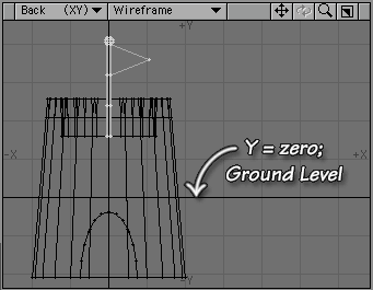
This looks great, but it's partially underground! That won't do. Let's fix it.
We want the two layers to retain their relative positions, so we need to move them both at once. In order to do that, they both have to be in the Foreground. (You can't move things on background layers.)
So, hold down the Shift key, and click on the Layer Icon for the First layer.
![]()
It's that easy. You can have any number of layers showing simultaneously, in either the foreground or background, by holding down the Shift key and clicking on them. (That won't select a range, just the individual layers.) You can hide visible layers the same way; hold down Shift and click.
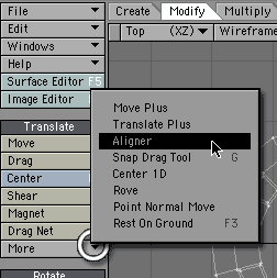
Go to the Modify tab, to the Translate section, and choose Aligner from the More drop down.
A Panel appears that allows you to choose what to align with what. Right now, we are aligning the model with the World, which is the default. We want the tower centered on the X and Z axes, with its base even with the Y axis.
So leave X and Z at c (for center) and click on the + for the Y axis, to put the model on the Positive (top) side of the axis.
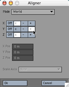
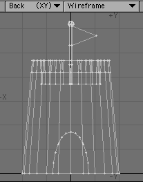
Click OK, and there it is, neatly sitting on the ground.
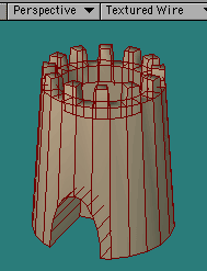
The only thing left to do is pick surfaces. Since it's a simple model, we'll pick simple surfaces, too. (This tutorial is long enough, after all.)
Tap 1 (one) on the regular keyboard (not the numeric keypad) to isolate Layer 1 in the foreground. Now, tap the q key, (or click the Surface button at the bottom of the screen.)
![]()
This opens the Change Surface Panel.
Uncheck Make Default, (unless you want all new objects you make to have this surface.) Type a name into the Name field. (Let's use Sand.) That will enable the Set Initial Color portion of the requester. Leave it enabled, and choose a sandy color.
Leave Diffuse set at 100% so that the surface will react normally to light, and Specular at 0 so it won't look glossy. Check Smoothing to get rid of the faceted look, and click OK. Your tower is no longer grey!
Tap 2 on the keyboard, or click on the second layer icon, and we'll color the flag.
We want the flag and the pole to be different colors, so we'll give them two separate surfaces. It's easy enough to do.
Switch to Polygon Selection, and run your cursor over the flag in the Back view. You should be selecting 4 polygons. (Sel: 4.)
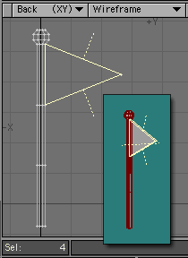
When you have them, tap the q key, Name the new surface Flag, and choose a color for it. Make sure that Smoothing is unchecked; the flag should look flat. Click OK to close the Panel.
Now we want to isolate the pole. We could drop the flag polys and select it; but there's an easier way. Tap the - (hyphen or minus) key, and the flag vanishes. Don't panic! It's not gone, just hidden. (In fact, you can see it if you want to. Just hold down Shift, and tap the \ (backslash) key. That swaps the hidden polys for the unhidden ones. Shift+\ again will show the pole, and hide the flag once more.)
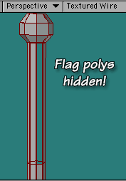
Tap q, give the pole a new surface with smoothing (you should know how by now,) and tap \ (backslash) to unhide everything.
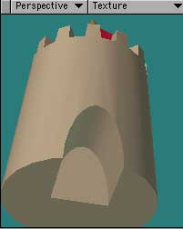
Switch to Textured style in the Perspective view, so we can see what we have.
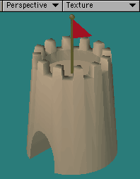
That looks pretty good; except there are strange grooves in the tower between the crenellations, and the crenellations themselves look blunted. Both of those are a result of too much smoothing. Whenever you see odd shading that you didn't model into the geometry, or when corners that you intended to be sharp look rounded, check the smoothing value.
Let's fix that as the final step.
Click on the Surface Editor button, or tap F5 on your keyboard, to open the Surface Editor.
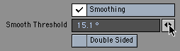
Choose Sand from the list on the left, and look at the bottom, where it says Smoothing. This is where you can set the Smooth Threshold. You want it to be just a tiny bit higher than the largest angle you want smoothed.
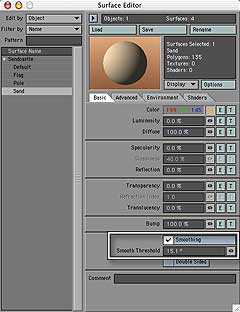
We made the castle using a disc with 24 sides, if you remember. So they'll have a 15° angle to each other. (360° in a circle, divided by 24 sides.) We need just a hair more, so set the Smoothing Angle to 15.1°. And the unpleasant furrows are gone, just like that.
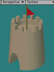
But wait! We can see flat polys in the doorway, and we don't want that. (How bad the faceting is in your model, or even if there's any at all, will depend on the shape of your doorway, of course.)
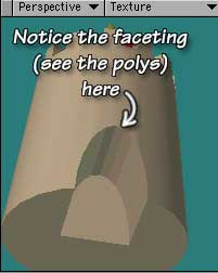
Tilt the tower in the Perspective view, so you can see what you are doing, put your cursor on the arrows at the end of the text field (known as Spinners) and drag to the right to increase the value.
As you do, keep your eye on those polys. When you are satisfied with the balance between the sides of the tower, and the sides of the doorway, stop. (If you go too far, of course, dragging left will decrease the value.)
And that's it! We could do a lot more with this, and we just may (in future tutorials.)
But, for now, I hope you are feeling more comfortable with LightWave. Feel free to explore on your own, of course. Open the Presets shelf (Windows > Presets Panel... or F9, while the Surface Editor is open,) and see if there is a surface there that you want to use on your castle. While you're in the Surface Editor, click on the T to get a texture in one of the channels, and play with that.
Explore and have fun. LightWave is incredibly rich, and there is always more to learn. But, as you can see, it's not difficult to make things you can use with only a few tools.