Creating Stained Glass in LightWave

This tutorial was written for Lightwave 8. There are files available for you to download if you would like; but they are not required to complete the tutorial. Most of the images are shown fairly small, to ease download time. If you would like to see them full-size, just click on the picture. (Many of the large images show panels and interface elements not visible in the small image.)

Stained glass windows are one of those things that can make an indoor scene special; but it seems that every program has its own way of doing effective stained glass.

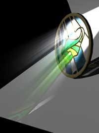
In LightWave, it's the Color Filter setting on the Advanced tab in the Surface Editor that gives stained glass its rich hues, the ability to color everything behind it, and the colored light that makes patterns on the walls and floor when Ray Traced Shadows are used. Just put a value there, and you'll have colored glass.

However, there are tricks to making it look really good of course, and I’ve been asked to do a tutorial explaining the ones I know. So here you go!

In most cases, you won't need to model your stained glass at all; a Stained Glass Surface will fill 99.44% of your needs. Since extra polys just add to render time, don't use them if you don't have to. The entire tutorial deals with making that Surface.

To begin with, you will need an image of Stained Glass to use. You can photograph an antique window, or a window that was designed and created by someone who is willing to give you permission. You can use one of the hundreds of Stained Glass Window designs available in books, CDs, or on the web, if you have permission to do so. Or you can design it yourself.

How much work you need to do to turn that image into Stained Glass depends on how much detail you need, and whether or not the leading in your image is black. If you don't need much, and you have a good picture of your window with black leading, you can skip most of the steps, and just do the Quick and Easy Method. We'll do the other steps, and you can join us here.

Some things aren't possible in Stained Glass

Draw a Possible Design for greater realism

If you decide to design your own glass, remember that, theoretically, this window will be constructed from a brittle material that is cut by scoring along a line, and then tapping the glass to fracture along the score.

Because of this, some shapes are virtually impossible to cut. Your glass will look more realistic if you limit the shape of the "pieces" to fairly gentle curves and straight lines. This doesn't mean that you can't have a scalloped edge; you can. But avoid areas that are "drilled" out of the middle of another piece of glass, and avoid sharp corners that end in the middle of a piece. If your design calls for elements like that, split the "background" piece of glass into smaller pieces.

Take a look at some real stained glass designs to get a feeling for the construction.

Personally, I tend to design the glass in Adobe Illustrator, and bring it into Adobe Photoshop for coloring and texturing. In most cases, you want to have what looks like a finished window, including any painting on the glass, fused glass, art glass, and so on.

There are some excellent tutorials explaining how to do this in a couple of packages here and here. You can probably convert the ideas to use in your own graphics program of choice without difficulty.

If you want to design your own art glass, go for it! If you would rather use "real" glass, Spectrum Glass very generously allows the use of its product for a host of things. If you aren't sure if your use qualifies, write and ask, of course.

Remember when you are doing this that the leading won't necessarily be black, although it generally looks black if the window is old. But came (the flexible metal bits with a channel inside that hold the pieces of glass together) comes in brass and zinc, as well as lead; and many windows, especially those with small pieces of glass, are put together with copper foil. (Once again, looking at came on the web will only take a moment, and your homework can make the finished piece much more realistic.)

So, if the window is new, the leading can be any metallic color you desire. (I'm using brass, just to show what I mean.

The image for the Color Channel

If you are going to be separating out the leading or glass colors for extra treatment in LightWave, you will need to save several different images. I decided not to do a step by step about how to make them, since it would make this tutorial too long. But if enough people ask, I might write another one that explains the process I use.

First, you need the color image, which (of course) is the glass in its full color, including the color of the leading. This is the only one you need if you are going for a Quick and Easy window, and you are using black leading.

Call it SGColor.jpg for purposes of this tutorial. (If you want to use this image to follow along for the tutorial, click the picture to open the page with the full size .jpg, and copy it to the Images folder of your Content folder.)

The Alpha image for the Leading

If you want to be able to give the Leading a different Diffuse, Transparency, Specularity, Gloss, Translucency etc. Value than the rest of the glass, (and if it's going to be prominent in your image you very well might,) then you'll want just the leading saved separately, to use as an Alpha Layer in the layer stacks of those channels. Invert it, so the leading is white and the rest is black, so the alpha will be applied to the leading only.

Save it as SGLeading.jpg (Once again, click and grab the large image if you want to follow along.)

The image for the Transparency Channel

If you are using a mixture of opaque and transparent glass, you will probably want a separate Transparency map, as well. It's probably easiest to just do it as various grays in your graphic package, remembering that white will be totally transparent, and black will be totally opaque. (Also remember that light isn't going to come through anything that's totally opaque; so if you want colored light cast on the walls, floor, and Sam as he comes walking through the frame, don't make any glass more than 50% opaque; that is 50% black.)

Remember that white glass is generally opaque, so if you are using glass that has white mixed into a color, you'll need to Invert the colors in your graphics program.

(If you just want opaque leading, of course, you can do that with the SGLeading image. No need to make another.)

Save that one as SGTransp.jpg, if you decide to use it. (You know the drill, if you to use my images!)

The Image for the Bump Channel

You might also want a bump map, if you have an window that's going to be close enough to the camera for the bump to be noticeable. (Remember, don't use any more detail than you need when doing 3D work. It not only wastes your time, it wastes render time!)

That bump map might have bumps for the glass, too. You can put them in here, if you already know just what texture you want. The main thing that they'll do is break up whatever shows through the glass, which can greatly enhance the realism.

Save this one as - you guessed it - SGBump.jpg! (And you know what to do, if you want to use mine.)

An Alpha Image for a single glass color

These are the main maps that you are likely to need, unless your window is going to be a focal point, and you are going to need to tweak the parameters of the glass individually. If that's the case, then you will probably want to save a Mess O' Maps; one for each color of glass that you can use as Alpha maps to isolate each type of glass in each channel.

This undoubtedly gives you far more flexibility, but it's also far more work. So only do this if you know that you are going to need it.

You'll want to save those using their color or part names, probably. If you are going that route, by the way, you won't need to make any of the other images except SGLeading (unless you have painted glass.) You can, literally, apply the color, even art glass multi-colors, and all the rest of it by using various procedural textures inside of LightWave. You don't have to; but you can. And if you aren't sure if you'll want the flowers to be blue or pink, you might want to.

This one is for the blue glass in the sky, so I'm calling it SGBlueSky.jpg. And yes, we are going to use it later, just to show you what I'm talking about, so if you want it... you know!

A window with an irregular shape will need an additional file.

In addition, if your window isn't a rectangle or circle, you will probably want to save the shape as an .eps (Encapsulated Post Script) or .ai 8 or lower (Adobe Illustrator 8 or earlier) file, to make it easier.

For instance, if we were using this window (which I decided not to do, after designing it for this tutorial, since it was too complex to make out at small sizes,) I would save it from Illustrator as an .ai 8 (or lower) file, which LightWave will open.

When you have your window designed, and all the various files safely saved, we’re ready to move to LightWave! (At last!)

If you need to load a Shape, Import EPSF

Open LightWave Modeler, or begin a New object if it’s already open.

If you saved a SGShape file, go to File > Import > EPSF Loader. This will open a dialog that allows you to choose the options for importing your .ai or .eps file.

(If you didn't, or you know how to import an .eps file, you can skip ahead to here.)

Import the Shape for your window

Use Standard Curve Division Level, Convert to Closed Polygons and PolyLines.

To the right of the EPSF File text field, there's an arrow. Click on it to open your normal System Browsing Window, and browse to the SGShape.ai file (or whatever you called yours.)

Uncheck Auto AxisDrill, unless your window has empty portions, with no glass. Auto AxisDrill will automatically drill those portions, and your poly will have the holes you need; but if you don't have holes, don't take the time to look for them!

Leave Auto Centering enabled, so the window will come in at 0,0,0. Also just leave the Scale, unless you know you want to change it. You'll be scaling the window to fit, anyway, so it's not important.

Click OK, and your file will be imported into LightWave as a single polygon, with as many points as it takes.

Use the Extrude tool to give the window depth, if needed.

Of course, if your window is rectangular or circular, you can skip all of this, and just use the Box, Ball or Disk tools to make the shape.

For rectangular windows that you designed yourself, you can enter the Pixel dimensions, with the decimal point wherever you want it, into the Width and Height fields when you make the box, and be assured of a distortion-free window.

If you are going to be using Refraction on your window, you will need to give it some depth, so the glass will have thickness. Do that by using the Extrude tool (Multiply > Extrude, or E). Hold down the Control/ctrl key to restrain movement, and pull it out along the appropriate axis, Z in this case. (Then check, to make sure the polys don't need to be Flipped (F).)

If you know you're not going to be using Ray Trace Refraction, skip this step, and make a single-poly window! The render cycles you save may be your own.

Change the Surface of the window

Give it a surface by tapping q. Call it something like SGSurface.

If you want to use Refraction, you'll need to make the air polys, too, so Select the model, Copy, Paste, Flip, and call the surface SGAir, as usual. (If you don't know what I'm talking about, please see the tutorial on Transparency in LightWave.

That's it for the modeling! The stuff that makes it into stained glass is done completely with textures, on this simple shape. (If you're not using refraction, it might be as simple as a single poly!)

Note: Don't subpatch this. Glass is flat.

Save it as StainedGlass.lwo, and send it to Layout. We're about to make a stained glass window!

(You can do all the surfacing Modeler, of course, but I find it easier to do where I can see the results as I work, using VIPER or FPrime.)

Moving on to Layout!

Set the lights up the way they will be in your scene. If you don't know how they'll be set there, then I suggest that you back light the window, as well as lighting it dimly from the front.

You'll want to either use a light Backdrop (Window > Backdrop Options, or Control+F5) or something with a light color behind the window, so you can see the design as you work. (We're going to make it transparent, and transparent objects in front of a black background look black.) Tap d and set the Camera View Background to Backdrop Color, if you are going that route, so you can see it in the Camera viewport, too.

You might also want to put something white in front of the window, so you can keep an eye on the quality of the colors coming through it.

Set up Ray Trace Shadows, or the shadow of the glass will be solid.

IMPORTANT; On the Render Options panel (Render tab, Options: Render Options) enable Ray Trace Shadows. If you don't, you won't see any color coming through at all.

You'll also want to use Ray Trace as the Shadow Type for the lights that shine through the window. Shadow maps ignore transparency.

Open the Color Channel Texture Editor

Okay. We are ready to roll! Open the Surface Editor to the Basic Tab, make sure that your SGSurface is selected, and click on the T in the Color Channel to open the Texture Editor.

Load the Color Image

The default Layer Type is Image Map, and that's what we want, so leave that. We also want Planar Projection, using the axis the window is perpendicular to; Z in this case. Load your SGColor image by choosing Load Image from the Image drop down menu, and browsing to SGColor.

Set the Tiling to Reset to use the image once only.

You are likely to see a bunch of little windows, tiled neatly on your Window shape.

This isn't what we want, so, in the second section, choose Reset from the menu for both Width and Height Tiling. That gives us one each, but the size is probably wrong. (Do this even if you only have a partial image showing in the first place, to keep it from trying to tile.)

Use Automatic Sizing to make the iamge fit perfectly.

Look a little farther down the dialog, and you'll see a button labeled Automatic Sizing.

Click on it, and the image will perfectly cover the window, without distortion (assuming that the proportions on the object are correct to start with.)

Use Copy Layer to keep from doing all of this again.

At the top of the Layers portion of the panel, you'll see an option to Copy the Layer. Do this. It will save time when we are adding other images to other channels, since the projection axis, tiling, and size are already set.

Add the Image Layer to the Diffuse Layer Stack.

Move down to the Diffuse channel. This determines how much light is bounced back from the object.

Transparent surfaces, like glass, have very low Diffuse values, unless they are remarkably dusty and dirty. Opaque, non-reflective surfaces, like the leading, have high Diffuse values. So we need a way to give the glass a low value, and the leading a high one. We are going to use a texture with an alpha layer for this, so, once again, click the T.

(If you are doing the Quick and Easy method, and don't have any more maps, you can skip ahead. A low Diffuse will make the leading black, even if it's not already, but it probably wont matter that much. The only problem you might run into is colored light through non-black leading for the Transparency or Translucency channels. If this is a serious problem, you can change the leading color to black, or just make those maps. So, if you want to skip the next steps, just choose the values for the various channels on the Basic tab, and then go here.)

If you closed the Texture panel after the last step, it will re-open. If you didn't, the name on the top will change, to show that you are now working in the Diffuse channel, not the Color channel.

Above the Layer Stack, choose Paste > Add to Layers. This will put the Image layer from the Color channel at the top of the Layer Stack, with the default layer that was in there when you opened the Panel beneath it.

Load SGLeading, and change the Blending to Alpha.

In the Image layer, load the SGLeading image, the one with the isolated leading.

Then, at the top of the panel, change the Blending Mode to Alpha.

Change the lower layer to Procedural Value, at 100%.

Select the lower layer in the stack, and change it to Procedural Texture.

Choose Value from the Procedural Texture list. Set the value to 100% by typing 100 into the text field.

This combination of layers will give the leading 100% diffusion, while the glass will have whatever you set in the main panel. It does this because Alpha blending allows the underlying layer to show where the Alpha has white pixels, and blocks it where the pixels are black. Gray pixels partially block it, depending on the shade of gray, of course.

The Effect of using the Alpha Map on the Leading.

Back on the Basic tab, set the Diffuse value to 20%, (or whatever value you desire.) There you go! You wont be able to see it on black leading (unless you temporarily disable the Color texture by clicking in its Layer, so the color becomes the default gray,) but you now have leading that bounces the light back to the camera, and glass that passes it through. (Or will, when we set the transparency.)

Copy All Layers, so from now on you can use Replace All Layers and already have the lower layer set to Value, and the upper one set to Alpha Blending.

NOTE: In the image shown, I've messed with the Levels, so you can see the window more clearly. Yours might appear considerably darker than this.

Use the SGTransp image, and light comes through the window.

Proceed this way for the remaining layers, using Paste > Replace All Layers if you want to keep the Alpha Map and Value so you can easily set different Specularity and Glossiness values for your glass and leading.

If you made different Alpha Images for each glass color, this is how you use them. Alpha maps only affect the layer directly below them, so they won't interfere with each other. (We'll be actually doing that in a bit.)

. Remember as you do this that adding detail that cannot be seen not only wastes your time, it wastes computer cycles. So only do it if you have them to waste, (no deadline,) and you want to play!

When you get to the Transparency channel, if you saved a SGTransp file, load it. This one isn't an Alpha Map, so you will only need the single layer. (Just Delete the Value Layer, and change the Blending Mode back to Normal, if you've been pasting the two layers.)

Otherwise, if your leading isn't black, use the Alpha trick again, to keep light from coming through it.

As you can see, the glass won't have any color at this stage. That's normal, because we haven't told it to yet. Don't panic, and just keep going. I promise we'll get there! (In fact, we'll be going back and tweaking this later, when we have all the channels filled, so we can see what we're doing.)

Traslucency adds some color to the glass, but not much. It's mostly for "Glow".

When you get to the Translucency channel, set it up the same way that you did the others; but be aware that this is what will give your glass that “glow.” A good starting value is 100%.

If you're leading isn't black, you'll need to use the trick with the SGLeading image as an alpha layer to reduce the Translucency for the leading to 0%. Otherwise, the leading will glow whatever color it is, too, when the window is backlit; which probably isn't what you want.

You'll start to see some color here, but this isn't the prime driver of colored glass, so don't use it to tweak the color. Once again, wait until the basic setup is finished, and then tweak!

Add the Bump, if you have it, and it will be seen in the final render.

Finally, to get the bump, load the SGBump map you saved in the channel, as always. (Just load the image, without the Alpha, much as you did for the Color and Transparency channels.)

Notice how the bump in the clear glass is breaking up the lines in the glass shadow behind it. (You can see it most clearly on the right, just below the leaf.) That's the primary reason to use bump in a window like this, and it makes it all seem much more real.

Color Filter, on the Advanced Tab, makes it stained glass!

That's it for the Basic tab; but the essential characteristic of Stained Glass is that the light that comes through it takes on the color of the glass, and also casts colored pictures on the floor, wall, and passersby.

To do that in LightWave, move to the Advanced tab, and put a number in the Color Filter field. I recommend 100%, since you want the color to be completely saturated. You can push it beyond 100%, of course, if you want super saturation.

Try it, and see the Magic!

NOTE: I didn't touch the levels in this one.

Lower Transparency gives more Translucency, but less color in the shadows.

Okay. Now we can start to tweak!

Transparency in stained glass is tricky. The more transparent the glass, the brighter the colors cast in the shadow when the light streams through it, but the less the window will appear to “glow” against a dark background. (Unless you cheat and use Luminosity, of course. Which is always an option, so don't ignore it. As always, it all depends on the final effect you need.)

Transparency and Translucency interact with each other; so, as always, it depends on your needs. Do you have to see things through the glass? How much glow do you need? Use plenty of test renders, at very low resolution, to balance these values.

As an example, I've reduced the Layer Opacity of the SGTransp image layer to 30% in this render. (The Transparency channel value on the Basic Tab is 0%.) That keeps the same relative transparency that I used in render above, while reducing the total transparency. You can see how much brighter the window is; and you can also see that the pattern thrown on the backdrop has almost faded into plain gray shadow. Notice that the part of the window that's over the illuminated bit of the backdrop is bright in both cases. Stained glass against a light background always "glows."

Using an Alpha Map to change just one color.

In the case of this particular window, I'm pretty happy with most of the glass while using the 100% of the SGTransp image, but the blue sky sections are too transparent. Milky blue glass, like this, should be much more translucent, and not nearly as transparent.

I could redo the whole SGTransp image, but that's a pain, and what happens if I still don't get it right? I could waste hours tweaking it in Photoshop.

A much more elegant solution is to use the SGBlueSky image, that we just happened to save earlier, in the Layer Stack. All you have to do is paste the double layer, as you've been doing, above the layer that contains the SGTransp image.

Since the Alpha will affect only the layer directly below it, it won't interfere with that image.

I set the Value in the Procedural Value layer to 0%, or completely opaque, and then reduced the Layer Opacity of that layer to 60%. That allowed me to interactively reduce the transparency, while still retaining the glass pattern. You might want to experiment with other Blending Modes on the Value layer, to get other effects. For instance, if you use Additive blending, you can increase the transparency. Experiment (with a non-zero Value layer, of course,) and choose the one that best meets your needs.

To Blur the Glass Shadow, use an Area Light

Finally, when you are rendering, you will find that you can't use Shadow Maps for Stained Glass; they don't work with transparency.

However, you can use Area Lights to blur the images coming through the glass quite effectively. (Don't forget to halve the intensity of the light. Area lights are usually about twice as bright as spotlights.)

Light Streaming through the Glass

And yes, of course you can have colored rays streaming through the windows if you want them.

Just enable Volumetric light in the Light Properties panel, choose your settings from the Volumetric Options as usual, and don't forget to enable Ray Trace Transparency in the Render Options panel if you want to see the volumetric light behind the glass. (Fine tuning all of that is fodder for another tutorial, I'm afraid.)

And that's it. As I’ve said several times in this tutorial, you can make your glass as detailed in the rendering as you like. Using the Quick and Easy method, (just a photograph of an actual window,) can save time both in prep and rendering, and is probably all that you really need for most work.

However, for the times when the window is a more integral actor in the scene, or when you need to view it with various lighting conditions, or from various angles as your animation progresses, you now have the knowledge you need to build a complex, highly detailed window.

You might, for extreme closeup work, need to build the actual leading. But that's a whole lot of extra polys, and isn't necessary for 99% of the windows you'll need, so I'm not going into it here. (If I get a lot of requests, I might make a different tutorial about how to do that later.)

Just remember these five things, and you'll be fine,

  1. Color Filter, on the Advanced Tab, is what gives you colored glass.
  2. A transparent window in front of a dark background can't "glow;" you need a light background for that.
  3. Transparency affects Translucency; the more Transparent the object, the less Translucency will show.
  4. You can't use Shadow Maps to blur the light that comes through Stained Glass. Use Area Lights instead.
  5. Don't hesitate to push the values past 100% or use Luminosity if you need to. There are many reasons we are working in 3D, not in Real Life, and that's one of them!

Hope you found this tutorial helpful!

If you have a question, write to me and ask it!

If this tutorial has come lose from the frame it's supposed to be in, or is in someone else's frame, just click here to fix that. (You may need to select the Applying Decals tutorial after clicking.)

Everything on this site is copyright © Robin Wood; all rights reserved. Please do not use anything without permission. To get permission, write to Robin, and explain what you intend to use it for.